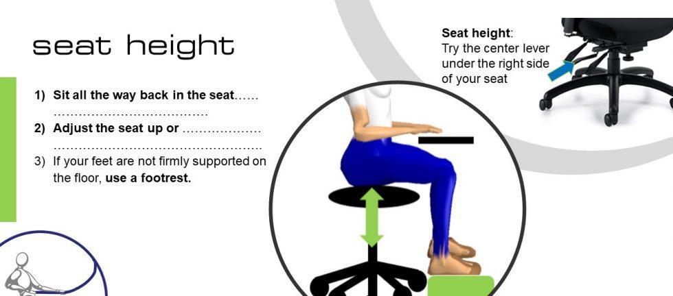
When you introduce a new piece of equipment, such as a platform, hoist, or even office furniture, you need to let people know how to use it. But let’s face it, it’s not easy to get people to read the manual. Who wants to waste time on boring stuff that is typically written in another country by someone with a passing understanding of English? Who can actually figure out what those icon-people are actually doing on the Swedish furniture instructions?
It’s often faster to tinker with a new gadget until you figure it out. But is that how we want people to learn at work? When it comes to “how to adjust” instructions, you can do better than the writers who “help” you assemble a bookcase! A hint: it’s all about the pics.
Even if you take considerable time to craft grammatically correct, spell-checked, logical instructions, you’ll be challenged to get anyone to read a paragraph of text.
Here are a few things to try:
- Dumb down your instructions to a bullet list. What does the user need to do, step-by-step, to use the new feature? 90% of the editing I do for our ergonomists involves the delete key. Keep it simple.
- Include before and after photos – everyone loves a makeover!
- Seek out a model that everyone will recognize, such as your CEO or the Health and Safety Co-Chairs. No kidding. People love to look at photos of people they know. And by modelling for you, these folks lend their support for the ergo program.
- Include photographs of tall and small people to demonstrate why it’s important to adjust.
- Consider using videos if you have the tech to support it.
- If you don’t want humans in your posters, you can ask an ergonomist to create graphics using biomechanics software, like those shown above. These posters will look professional and should stand the test of time, but they may not grab quite as much attention as your CEO’s photos!
Need some help? We’re only a call or email away. We LOVE making posters, videos and flip-books!


