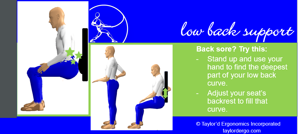
Let’s face it: people don’t read the manual. Most of us will tinker with a new gadget until we figure it out. When it comes to adjustability features in the workplace, ergonomists push to make them available, but they are woefully underutilized. Adjustable chairs, hydraulic lift tables, sit-stand desks, tool balancers…. the list of poorly used equipment could make an ergonomist crawl under her desk and hide. People don’t take the time to figure out how the adjustability features work.
When promoting the use of adjustability features, we can do better than the writers who are hired to help you assemble a bookcase. A hint: it’s all about the pics. Even if you take time to craft grammatically correct, spell-checked, logical instructions, you’re probably not going to get everyone to read them. Instead, we recommend the following:
- Start by dumbing down your detailed instructions to a bullet list.
- Include “before” and “after” photos – everyone loves a makeover!
- Using photographs? Seek out a model that everyone will recognize, such as your CEO or the Health and Safety Committee Co-Chairs.
- If you don’t want humans in your posters, you can ask an ergonomist to create graphics using biomechanics software.
Adjusting a computer workstation involves many steps. In the image above, I spent about an hour creating very simple images to show why and how to adjust lumbar support. A second slide could show how to use the features of the chair specifically provided by the employer. Images like these could be dispensed in small doses over several days or weeks.
If I had a nickel for every time that I made a small adjustment to a seat with shockingly positive results…well, I’d have a Sudbury-sized pile of nickels. 😉 It’s not enough to provide adjustable equipment. We need to teach people how to use it. And to do that, we need to clearly communicate why and how to make the adjustments.
Posters can be used for more than adjustment instructions. We use posters and bulletins to:
– show workplace strength and stretching activities
– share success stories
– keep people thinking about ergonomics at home and at work
– demonstrate a “best practice” or tip that would be helpful to workers who are learning a new job
The bottom line: images get more attention than text. So, when you’re creating images, take the time to make them clear and compelling. We’d love to help!


